Skip to the page
Dev log

From the build.

What we made on ALBEE-9 lately, and why. Newest first. The small games keep their own notes on their pages.

The studio splash at rest: the creature standing on JIBBICK, with STUDIOS beneath

Record 03

The creature finds its feet

ALBEE-9 now opens with the studio's mark. In the dark, two eyes open. The creature's body follows, it blinks once, takes four small steps along the name and settles on top of JIBBICK, with STUDIOS fading in beneath. It takes about four and a half seconds.

You can skip it after half a second, and the press that skips it never reaches the title screen, so nobody starts a game by accident. With reduced motion on, it's a short fade of the finished picture instead.

The letters are our own. We drew them for the splash and called them Lamplighter: ten letters, no font. They're the same letters at the top of this page.
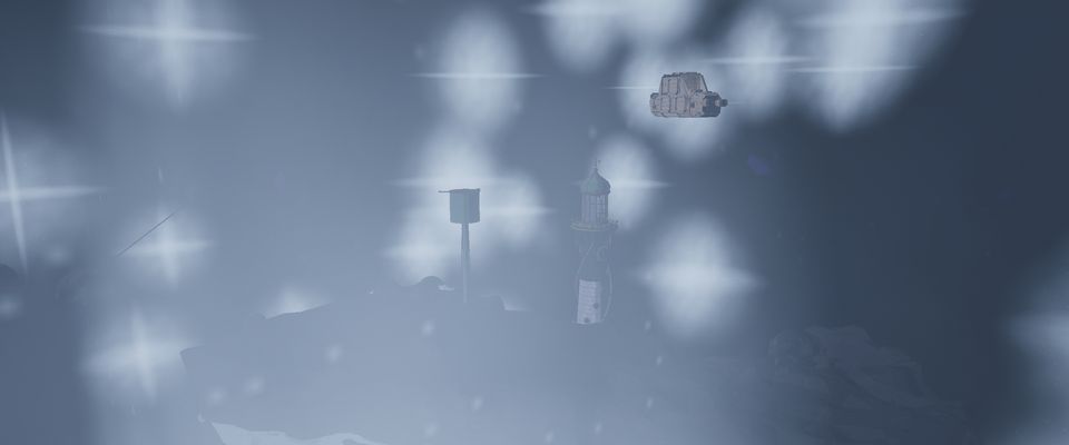
The ship arriving at the lighthouse through drifting dust

Record 02

Arriving, not appearing

After a jump, the next place used to blink into being: one frame it wasn't there, the next it was, fully lit and a little jittery. A playtest caught it straight away.

Now the place is already there when the jump's dark lifts, but unlit. The camera eases in for about three seconds while its lights come up, and then the mooring shot carries on. Skip the jump and this is skipped too; with reduced motion you get a still view while the lights rise.

The jitter had two causes we could measure: two cameras disagreeing about which one was in charge, and a place that moved towards the ship when it should have stayed still. The camera does the travelling now.

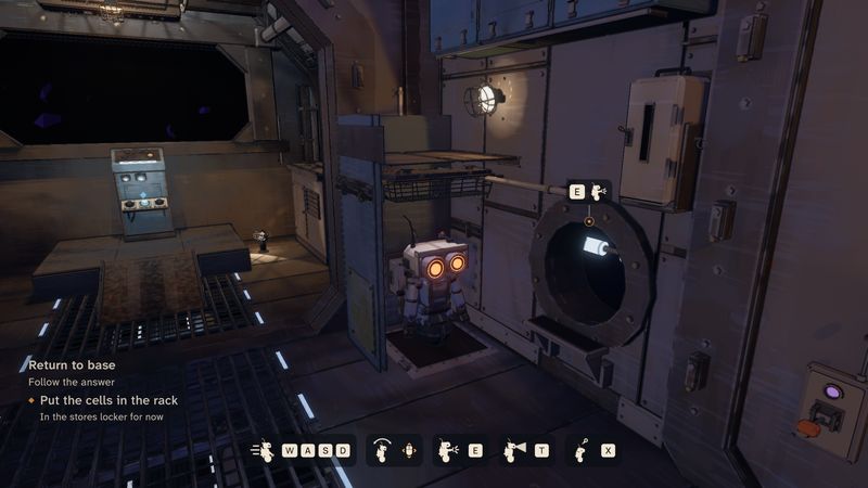
ALBEE-9 aboard its ship, with its goals at the lower left and the controls along the bottom

Record 01

A typeface you can read in the dark

ALBEE-9's world is dark on purpose, so its words have to work hard. We picked new type for the interface: Atkinson Hyperlegible Next for everything a player reads, B612 Mono for codes and readouts, and Newsreader for the storyteller's card. All three are open fonts. They're on trial in the build now.

Along with them came a few rules. Nothing a player has to read goes below 16 pixels, and short capital tags never below 14. All interface text is one cream. And the key you press shows its action's icon beside it, so you can see what it will do.

This site uses the same three faces now.